Sunday, 27 March 2011

Just Moving on

I have been working on some other things recently and will be posting these from now on as I have now completed the OCA CDA1 course - At last!  I am now just waiting to get the final report from my tutor and decide then whether or not to go for assessment. 

This is a bit of pure abstract digital art I have been having fun with.  I hope to be taking this a bit further and produce a painting or print based on this abstract image.

Friday, 25 March 2011

Modern British Sculpture Exhibition

I went to the Royal Academy yesterday to see the Modern British Sculpture Exhibition.  I had heard very varied and mostly negative comments about it from people who had been to see it and was not expecting to like it a great deal.  It goes to show you should never take any notice of anyone else's opinions and you should always go to see something and form your own. 

This was a great exhibition of sculpture from 1900 to the present day. It was very well curated; in the second room they showed ancient art in juxtaposition to contemporarty work in order to show where inspiration had come from for various pieces;.  It was in near enough chronological in order, thus emphasizing the temporal development of abstraction in sculpture.  It was not comprehensive in that there was limited space and there were mainly small works, with a few exceptions.  Some foreign artists who had spent time in Britain were shown where they were relevant to the development of British sculpture. 

I loved the more contemporary works but I couldn't really sketch them.  I would need to go back and spend more time there; I may if I can find the time before it closes on April 7th.

A great piece which I could not have sketched was Environmental Construction by Victor Pasmore and Richard Hamilton as exhibited in 1957.  A wonderful piece of perspex sheets coloured and clear hanging vertically and horizontally from fine steel wires.  This gives a real feeling of contained space; you just have to experience it to appreciate it fully.

Another piece I loved was "Stack" (2011) by Tony Cragg.  This was a huge cube of layers of "stuff" inculding matress, cardboard, cards of threads, old bowls and all sorts of waste and rubbish; the detritus of living sandwiched very neatly between, what appeared to be pieces of wooden pallet. It was like a piece of archaeology.

I did some very quick sketches of some pieces I particularly liked to remind me when I returned home.  I sometimes work these up from memory, by referring to these, in a larger sketchbook if I feel like it, or if they are relevant to work I am doing.


Friday, 18 March 2011

Assignment 5 CDA1 part 2

I have now just about finished the writing up on development of my ideas, which includes my second image of entitled Vases the first image being called Ghosts.  the first image was created from a number of scanned objects which were then manipulated and changed; whereas the second image was derived from a photograph from which I made a more abstract painting.  I developed the painting further into a more absract image and used photographs of this to create an abstract digital art image for this project.

Thi initial photograph was one of chimneypots taken in France last year.

This is the first painting made from this image but with one degree of abstraction.
The painting was inspired the Italian atist Giorgio Morandi who painted mainly still lifes in a limited pallet of indigo, yellow ochre, Naples yellow, burnt Sienna and white. 
The second painting with a second degree of abstraction with the same pallet as used above.

This is the digitized image derived from this painting and the third degree of abstraction along with the black and white image required for completion of the assignment.


The tonal contrast is evident in the greyscale version as well as the color version the difference in tone is graded from the background to the foreground giving an impression of depth.  This is aided by the framing of the objects with a darker tone on the left hand side and bottom third of the image behind the "objects".

Tuesday, 15 March 2011

Assignment 5 CDA1

I am just about ready to submit the fifth and final Assignment.

The brief was to create an image for a magazine using (Photoshop Elements techniques) that works in colour and black and white on the theme of Metamorphosis.  In addition to this, research into metamorphosis in historical terms was required as well ascarrying out research  into the theme in visual terms using drawings / sketches and other visual methods to develop ideas.

Ghosts - Final Version


Ghosts - Final Version B/W

I have written an essay on the history of metamorphois in art covering Cubism , Surrealism, Dada, Futurism and Bauhaus movement and placed these in a wider historical context.  I have researched the theme in visual terms giving examples of how I developed my ideas. And I have written up the way I developed my image and looked people's work who have completed the same course. 

Monday, 1 November 2010

Progress in Assignment 5

I have been thinking more about this subject and the piece of work I could produce for it.  Butterflies are quite high up in my thinking at the moment and I've thought of ways of producing butterflies from scallop shells and the sort of environment in which to place them.  I have been scanning in lots of leaves and shells as well as pens and also creating gradients and using filters to manipulate the scanned images.  The brief is to create an image for a magazine which could also be presented in black and white.  This is something that I need to bear in mind as it is quite hard to create a colour image with sufficient contrast to work well in both colour and black and white.

This is a very early stage in the composition.

The background sky is a gradient and clouds filter
Foreground is scanned leaves transformed with perspective
The trees are a disintegrating leaf treated with various filters and enhanced with blending modes
The Butterfly consist of scallop shells and an owl pen which have been manipulated with filters and blending modes both separately and together once combined and colour changes made after this


As stated above this is a very preliminary stage and  much needs much work before I am happy with it.  I think I need to make the background recede more by altering the contrast or creating some sort of gradient.   I need more content in the background, not just a stark horizon .  More variety in the trees and maybe a path or track leading the eye back into the picture. The "butterfly" is not right yet but I am using it in the mock ups just to get an idea of what needs to happen; I also would like to put in a flock of them but I'm not sure if I will be able to do this or if it would be visually successful.  Maybe a single insect would be better visually. If one looks at Magritte his images have only one or two objects but they have huge visual impact.

Sunday, 24 October 2010

PIET MONDRIAN

Whilst researching my 5th Assignment I came upon this animation - GENIUS!


This one really is relevant to metamorphosis! Great music too.

Wednesday, 1 September 2010

Hmm!

What to do? What to do?  The fifth assignment is really tough - Metamorphosis - yes that is the brief.  I am really stuck for an idea on this one.  I am studying what others have done and also the great and the good in the shape of Mondrian, Picasso, Man Ray the list goes on.  I have pulled every book off my shelf and gone to the internet too, to investigate this subject.The example they give in the course notes is not very inspiring but others who have done the course seem to have got to grips with it - why can't I?

I have gone through the exercises for each of the projects with varying degrees of success and enthusiasm.  Project 18 was quite tedious and repetitive and I haven't bothered to post any of the images here.  These are a few from Project 19.
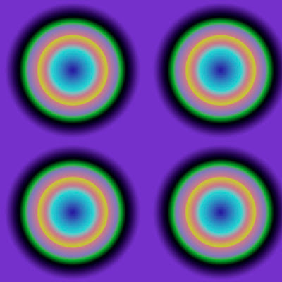

This is OP ART, made from a gradient I created and manipulated.  I really like the way the blue in the middle of the circles seems to expand and contract - at least it does for me. It also leaves an after image on the retina once you look away and look at a plain screen.


This is a photograph i took of leaves in autumn colour which has an ugly leaf stalk that would be better disguised.  This is exactly the same exercise as given in the course notes but obviously with a different tree.


I've cloned a leaf by painting it onto a separate layer and added a stalk to attach it to a visible stem, and added a highlight to the leaf.


This was created using the pattern clone tool, again a stalk was adapted to give a realistic attachment to a stem.  No highlight was added to this  version.
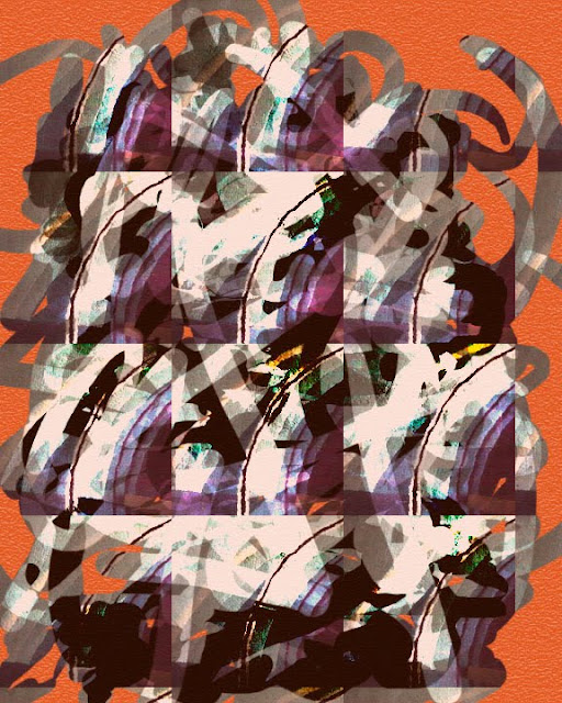

I was just playing with the pattern clone tool, paint brushes and modes here to produce an abstract painting.


This was a fun project too; I really enjoyed it.