Monday, 1 November 2010

Progress in Assignment 5

I have been thinking more about this subject and the piece of work I could produce for it.  Butterflies are quite high up in my thinking at the moment and I've thought of ways of producing butterflies from scallop shells and the sort of environment in which to place them.  I have been scanning in lots of leaves and shells as well as pens and also creating gradients and using filters to manipulate the scanned images.  The brief is to create an image for a magazine which could also be presented in black and white.  This is something that I need to bear in mind as it is quite hard to create a colour image with sufficient contrast to work well in both colour and black and white.

This is a very early stage in the composition.

The background sky is a gradient and clouds filter
Foreground is scanned leaves transformed with perspective
The trees are a disintegrating leaf treated with various filters and enhanced with blending modes
The Butterfly consist of scallop shells and an owl pen which have been manipulated with filters and blending modes both separately and together once combined and colour changes made after this


As stated above this is a very preliminary stage and  much needs much work before I am happy with it.  I think I need to make the background recede more by altering the contrast or creating some sort of gradient.   I need more content in the background, not just a stark horizon .  More variety in the trees and maybe a path or track leading the eye back into the picture. The "butterfly" is not right yet but I am using it in the mock ups just to get an idea of what needs to happen; I also would like to put in a flock of them but I'm not sure if I will be able to do this or if it would be visually successful.  Maybe a single insect would be better visually. If one looks at Magritte his images have only one or two objects but they have huge visual impact.

Sunday, 24 October 2010

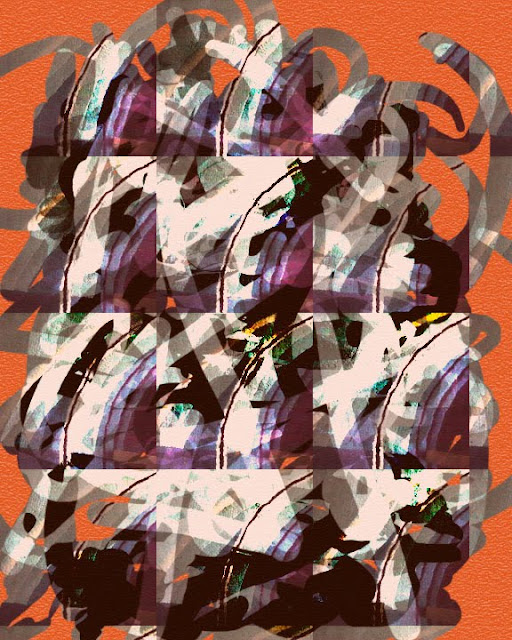
PIET MONDRIAN

Whilst researching my 5th Assignment I came upon this animation - GENIUS!


This one really is relevant to metamorphosis! Great music too.

Wednesday, 1 September 2010

Hmm!

What to do? What to do?  The fifth assignment is really tough - Metamorphosis - yes that is the brief.  I am really stuck for an idea on this one.  I am studying what others have done and also the great and the good in the shape of Mondrian, Picasso, Man Ray the list goes on.  I have pulled every book off my shelf and gone to the internet too, to investigate this subject.The example they give in the course notes is not very inspiring but others who have done the course seem to have got to grips with it - why can't I?

I have gone through the exercises for each of the projects with varying degrees of success and enthusiasm.  Project 18 was quite tedious and repetitive and I haven't bothered to post any of the images here.  These are a few from Project 19.


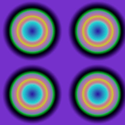
This is OP ART, made from a gradient I created and manipulated.  I really like the way the blue in the middle of the circles seems to expand and contract - at least it does for me. It also leaves an after image on the retina once you look away and look at a plain screen.


This is a photograph i took of leaves in autumn colour which has an ugly leaf stalk that would be better disguised.  This is exactly the same exercise as given in the course notes but obviously with a different tree.


I've cloned a leaf by painting it onto a separate layer and added a stalk to attach it to a visible stem, and added a highlight to the leaf.


This was created using the pattern clone tool, again a stalk was adapted to give a realistic attachment to a stem.  No highlight was added to this  version.


I was just playing with the pattern clone tool, paint brushes and modes here to produce an abstract painting.


This was a fun project too; I really enjoyed it.

Saturday, 21 August 2010

Project 17

Original image
Tracing with brush
Tracing refined and colour changed
Simple gradient
Simple gradient
Simple gradient
Texture layer
I have had a wonderful time with this project.  It involved tracing over an image, with the obvious selection problems; what to include or exclude, the colour, thickness, texture and so on.  All of which can be changed.  the instructions in the project suggest using lower opacity to begin with.  I can't say that I did this nor could see the logic behind it.  However, I did use the technique in a second layer to create shading with larger brushes and different opacity.  Transparency of layers allows you to alter the amount of visibility of the under layers and I allowed some of the background original image to show through in some versions thus adding some detail in the shawl.This series shows the gradual building up of the image and further manipulation that has been applied.  Clearly the possibilities are endless. As an aside,I now have a graphics tablet and pen which makes the whole process of "drawing" so much simpler than with the mouse; however, I still get cramp and that is very disappointing!  But I still love it.
Simple gradient

Shading
Combination of tracing, texture layer, simple gradient with
background layer just visible.
Tracing, shading, texture, simple gradient
Tracing refined and colour changed, shading, texture and
   combination of two simple gradients 
Grey scale showing the density levels of the texture layers
and the drawn elements


Posterized
Posterized and inverted

Tuesday, 10 August 2010

Assignment 4

I am now at a stage where I am able to submit my 4th assignment to my course tutor.  It has been an uphill struggle not least because I had no idea where I was going with this.  I have in fact produced two entirely different images, one photographic and another scanned.  I will submit the scanned version as the actual final image and the photography based version as the alternative.  I have succeeded in manipulating images by selection, moving, blending, enhancing, feathering, distorting and using filters. I've also created new fill patterns which I have inserted into this image.
Fake Fur

This image was created from scanned in separate images of a toothbrush, toothpaste, a toothpaste tube and lid scanned separately, a toy fur cat and silver food bag.

I first selected the image of the tube and the lid using the magnetic lasso and positioned the lid on the tube; I removed a section of the tube with a soft edged eraser brush. I placed this layer over the fur cat layer and deselected the area of the cat image not required. I used the enhance tools to enhance the contrast and bring out the texture of the fur.

I used text to create the word toothpaste and distorted it to make the shape of the word, I created a rectangular blue shape and masked out toothpaste to create a "stencil" placed this over the fur and selected the shape and flattened the image. I transferred this to the merged image of the toothpaste tube and cat fur and free transformed the shape to fit on the tube.

I selected the toothbrush shape, created a separate layer and positioned the brush under the squeezed paste layer. I masked out the squeezed toothpaste and shortened it to fit the scanned and selected toothbrush image.  I created a fill pattern with the fur and filled the squeezed toothpaste shape with this fill pattern.  I then used the liquefy filter to distort the squeezed fur paste.

A coloured background fill layer was created and a new pattern fill layer was made using a sample of the silver bag.  The opacity of this layer was altered to see the turquoise colour of the colour fill layer and the toothbrush layer opacity was lowered to see some of these layers through the semi-transparent plastic.

The whole image was flattened and final adjustments were made.  The blur tool was run around the edges to blend in the imperfections and marry the image with the background.  Finally a flash flare was added which produced the droplets to the left of the tube, thus creating an impression of a water droplet.

Magic Toadstools
The alternative image (Magic Toadstools) was created from digital photographic images.

Three images were used: the background bark layer was selected from the image of a tree; the ceramic handbag and the wooden toadstools.  The toadstools in reality are large objects in a children's play area at Westonbirt Arboretum and the "handbag" is quite small.

I used cloning tools and layers quite extensively over the raffia to enhance the 3D effect.  I also used enhancing and threshold to create the illusion of depth and shadows.  Similar tools were used in the creation of this image and the one above.

I feel I have learned a great deal from this module and the creation of the 4th Assignment.

Wednesday, 4 August 2010

Henry Moore at Tate Britain

As part of my learning log I have been going to exhibitions not all of them recorded here by any means.  Recently I went to the quilts exhibition at the V & A and an Exhibition of video artist Francis Alys - A Story of Deception. Both excellent in very different ways.  However today I went to the Henry Moore exhibition at Tate Britain.  This was a wonderful exhibition and covered most periods of his work from the 1920s to 1960s and explores his work from the early days and the development into abstraction of the human form. He spent much time in the British Museum sketching the ethnographic collection and the influence of these sculptures in his work is obvious from the very beginning.  Afterwards as his work became increasingly abstract other influences become apparent.
The sculptures were of various materials; plaster, wood stone and metal; and there were examples of his wonderful drawings in particular the London underground drawings at the time of the Blitz and his equally renowned Miners.  There were examples of his sketchbooks too - these were particularly inspiring
Fortunately it was not too crowded so I was able to make some quick sketches on my way round; examples of which I include here.

These were made in my small travelling sketchbook in pencil. .  The reclining figure and mother and child motifs featured greatly; however there were masks made in various materials and heads that were very impressive.  Amongst the 150 items shown were very large and very small works.  The difference in scale is not clear from my drawings.  Head 1930 in ironstone was no more than 8 or 10 inches high and the Mother and Child 1932 on the facing page in my book was roughly 4 ft high.